The Blue Jays' recent series in Houston didn't go well for them. But I did notice something interesting in the crowd: the preponderance of old Astros shirts.
To review: Houston's baseball team was originally called the Colt 45's. But when the city built the world's first domed stadium, it was named the Astrodome, in honour of the city's connection to the space program ("Houston, we have a problem.") Also, it was the 60's, and the future was still cool. So the team chose the name Astros. They also started taking their logos and uniforms in a bolder direction, by the mid-70's, they adopted snazzy white, orange, yellow and red uniforms, with an unapologetically modern font (Futura Bold?) Of course, traditionalists cringed.
Over the last quarter-century, the Astros have had a variety of inoffensive, but unmemorable uniforms and colour schemes. Today, their current black-and-orange unis hint at the old ones, but the traditional trim and fonts are incongruous.
But the weird thing is that you still see a lot of the gaudy old shirts in the stands. In fact, it seems like there are more of them than their current style. So essentially the fans have spoken, and whatever the marketers say, they think their team identity lies in those crazy 70's shirts.
Hopefully the team will realize this and build on it. I'm not expecting them to go back to that style, but they could come up with a design that pays tribute while looking more timeless. Essentially, the Blue Jays did this on a less extreme scale, bringing back their World Series era logo, fonts, and uniforms, albeit with some well-placed updates (it's amazing what a difference serifs make.)
I'm glad to see this. While baseball's history and tradition give it a gravitas most sports lack, it can get rather stuffy when self-appointed gatekeepers decide what is and isn't available. It's good to see that the sport still has room for a little irony.
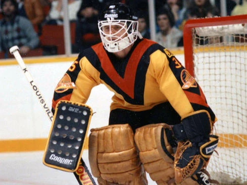
And if there can be rehabilitation for the Astros' notorious uniforms, maybe some others have a chance. The Raptors' old purple shirts still make a lot of appearances in the crowd, despite their tasteful current red and black. The Washington Capitals have brought back their outlandish star-spangled shirts. But the ultimate would be if the Vancouver Canucks and their fans warm to their old black, red, and yellow.
No comments:
Post a Comment